By Inara S. Tareque
There is no point in collecting or presenting data, if the target audience cannot comprehend them. Often times, it is not only very difficult to ascertain useful information from data presented in a complicated manner, but it is equally difficult to consolidate and recall the points that such data are trying to make. Thus, presenting information in an interesting and efficient manner that is accessible to a wide array of audience, or at least to the target audience is very important in today’s world, where supporting claims with proper convincing evidence is vital. Information design involves the very practice of presenting information in a coherent and comprehensible manner that can attract people’s attention.
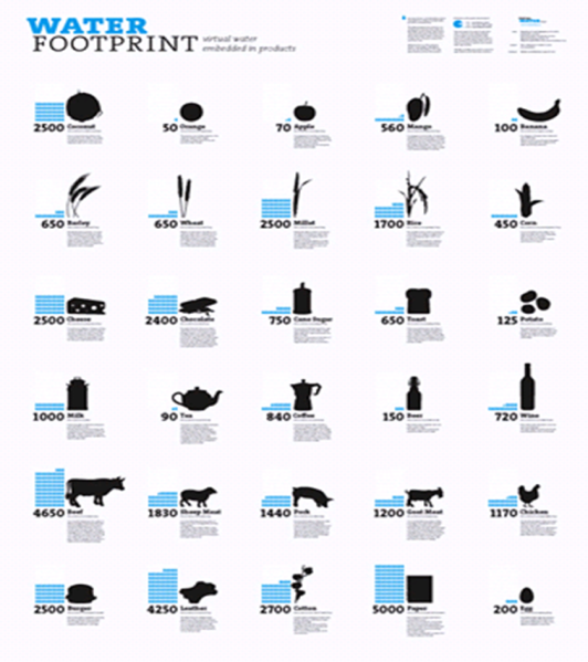
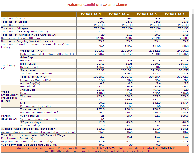
Figure 1 and 2 are clear examples of how the manner in which information is presented plays a crucial role in whether we can understand its message. It is evident that Figure 1 is much more comprehensible than Figure 2. Figure 1 shows how much freshwater is used to produce selected products, and it aims to convey a message that could ecourage the audience to rethink their consumption patterns. The figure is an excellent easy-to-understand infographic that clearly passes along its intended message. Figure 2 on the other hand is from The Mahatma Gandhi National Rural Act 2005, and it is trying to show “Mahatma Gandhi NREGA at a Glance”. Clearly, it has an awful design and does a very bad job at showing information “at a glance”. This is an example of very poor information design.
There are various tools available online that can help you design produce very attractive and informative infographs. Some of them are as follows:
- piktochart.com
This is a free and very easy to use website that has 100+ customizable templates and 1000+ existing images in its library to present information. The steps for using its tools are very clearly outlined in the website.
- easel.ly
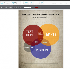
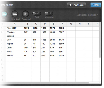
This website also has a variety of themes, and is one of the most popular websites for generating infographs. Creative graphs and other charts can easily be made by uploading data from an excel spreadsheet. The website even has a tutorial video that makes it very user friendly.
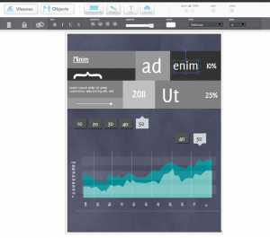
- infogr.am
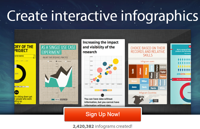
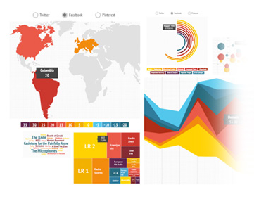
This is another great easy-to-use website that lets you create more than 30 types of charts, “anything from bubble charts and treemaps to simple pie charts.”
With such tools available, information design is as easy as it has ever been. Just searching “website to make infographic” on google yields hundreds of results that can redirect you to many other sites that are as good at the aforementioned sites.
Thus, there is a very important lesson to be learnt from these examples: no matter how convincing the data is, it will not grab people’s attention and convey its message without good information design. If you want others to understand your data, and convince them to believe the point that you are trying to make, designing the manner in which the information will be presented is one of the most important things that you should pay attention to. Luckily, this process of designing information has been made very easy by a number of user friendly websites.
What information design tool do you find most useful? Please comment here and let us know.
Inara S. Tareque is an intern with the Social Innovation Lab. She is an undergraduate student of Economics and Mathematics at Grinnell College, USA.