Why did we use analytics?
One of the goals of arranging an online challenge for the Innovation Fund for Mobile Money was to engage lots of people from diverse backgrounds in the brainstorming, to facilitate innovation. But how can we measure how successful we were?
How do you get the data?
Just by visiting a website, a lot of data is generated. Every single visit to the website gives the server a series of information, which includes things like the browser they are using, the operating system they are on, whether it’s a mobile or tablet, their location, ip address, how they were directed to the site, and which links they use. From this big collection of data only a few indicators are important for us if we want to measure whether our website was successful or not. For us that can be the number of visitors, how interactive they are, where they are from, and how much time they are spending on the site. People with other objectives can focus on different metrics.
What can you do with the data?
It is important in any program design or implementation that we have the right information at the right time in order to make decisions. Data analysis can help us do that. You can map out information about visitors’ location information from server log files and immediately show the diversity of our visitors. If we see the trend of how much time people spent on the website, that shows us how engaging the website was. When data lies in files it is not that useful. But when we pick the right indicator and plot it, it immediately gives us information that enables insights which were not possible before.
The Innovation Fund Challenge
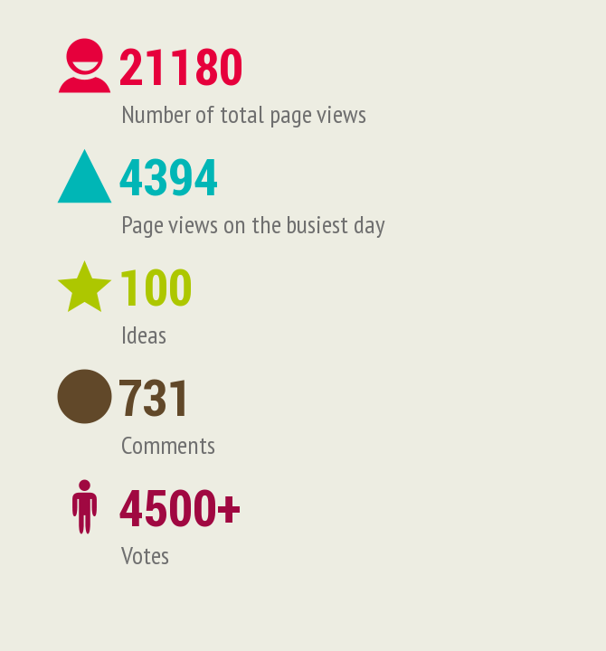
Over the course of the month long innovation fund challenge, we had more than 21,000 page views! In the busiest day it was 4394 views. 100 ideas were submitted. There were over 700 comments on the ideas and more than 4500 votes.

We promoted the site in different ways, and the analytics give us insights into what was most effective. A significant amount of people were directed to the site from BRAC official e-mails, some came from Facebook, others from Google. BRAC blog contributed a small percentage. And the majority (68%) came by directly typing the link in the browser or by copy-pasting the link or using their browser history—so we don’t know how they learned about it.

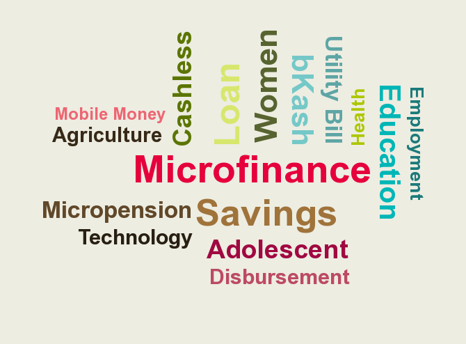
There is a trend of people spending more time on the website over time. More than half of the visitors spent less than 30 seconds on the website, which means they probably followed a link to an idea, voted and left. 14% of visitors spent more than 10 minutes on the website. The ideas on the web site reflected the diversity of the participants—we had ideas for Microfinance, Education, Health, Agriculture and many more, with everything from savings, loan disbursement, incentives, and utility bill to relief collection during emergency situations.
If you have questions about analytics, please feel free to write them in the comment box below.
Please see this link for the full and interactive Innovation Fund infrographic.
Rashedul Kabir is a software engineer ICT4D specialist with the BRAC social innovation lab.